Color Palette
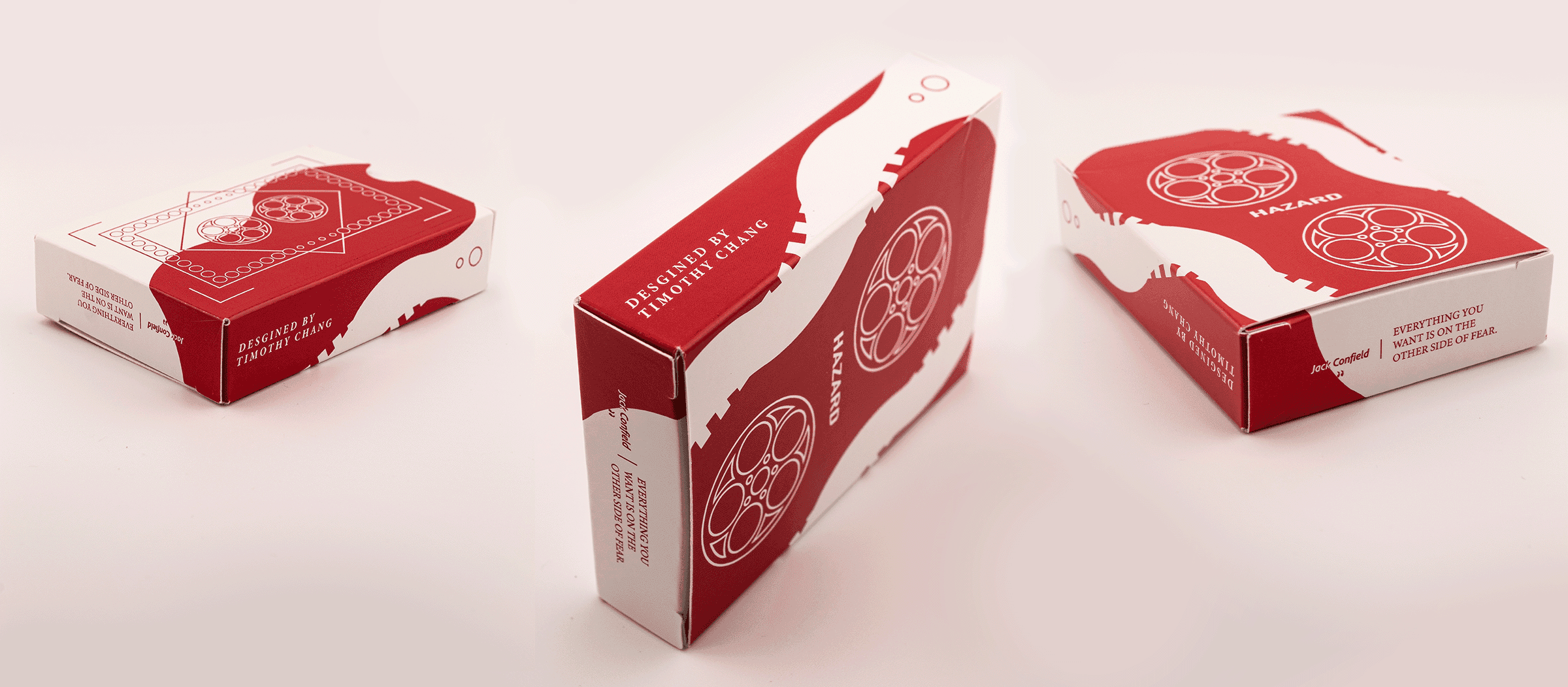
Hazard is built on a deliberate two-color system. A vibrant crimson anchors the visual identity, evoking the tension and risk inherent to motorsport. Paired against it, a light grey draws from the asphalt itself — the raw surface that defines every race. Together, the palette communicates both danger and discipline. Both hues extend into deeper, darker tones, introducing shadow and dimension that give the palette its weight.

Iconography
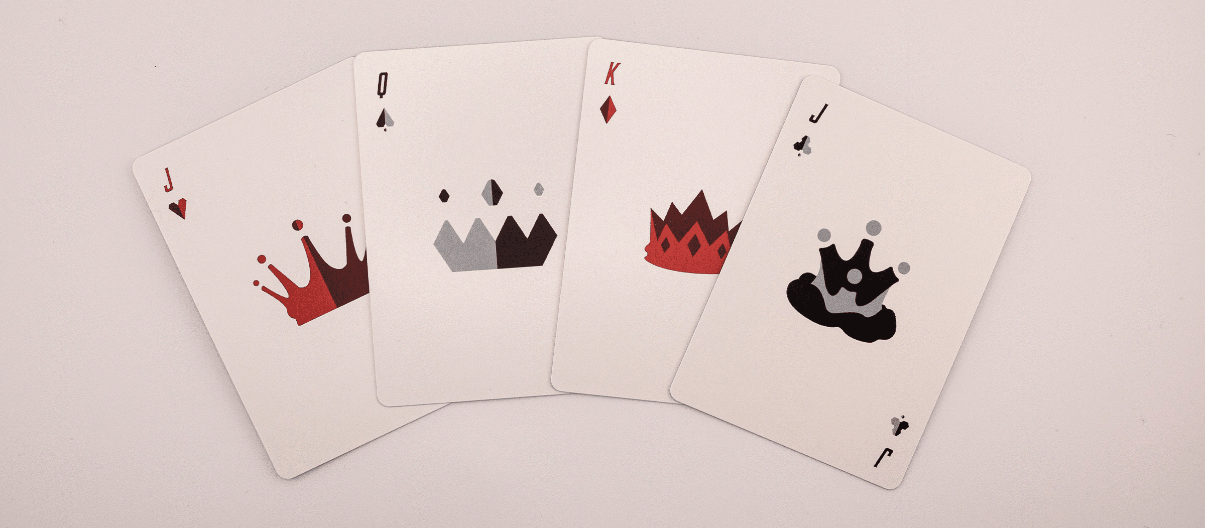
Hazard's icon design is rooted in the hazard light — a universal signal of danger, found on every vehicle and activated in moments of risk. This symbol forms the foundation of the primary mark, directly connecting the logo to the world of motorsport. From there, the concept extends throughout the system, with variations derived from each suit within the deck, adapting the core form to reflect the distinct role and hierarchy of each.